Router Web GUI
For ordinary users, the configuration page of D-Link router has so many advanced functions that it is difficult to complete even the basic settings. Not only did we want to make it "easy on the eyes", we also wanted to make certain actions that a lot of people might have thought were too advanced for them as easy to access and use as possible.
• More than 56 countries: Including Taiwan, the United States and Canada, Europe, Australia, India, Singapore, the Middle East (Dubai), Latin America, Brazil, Russia and China.
TIMELINE
- 2012/6~ 2013/12
- 18 months
TEAM
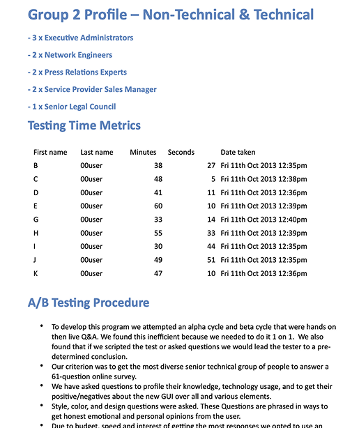
- 4 PM
- 1 PD (I'm here!)
- 1 FE
- 2 BE
- 3 QA
ROLE
- Research
- Wireframe
- Mockup
- User test
- Front-End
TOOLS
- Photoshop
- Illustrator
- html+CSS
Brief
This project was truly unforgettable — not only the toughest one with the most late nights, but also the one where we spent the most time aligning and refining the design. To completely revamp the old Web GUI from both a structural and flow perspective, I collaborated with four PMs and held design discussions almost every morning. From understanding complex functions, refining UX logic, to aligning with hardware constraints, we worked through every detail step by step. Looking back now, it still feels incredibly rewarding and satisfying!
Research
Problem & Needs
Customer Service Dep.
CSD collects customers feedback questions and comments
User Trial in US
When the product is completed, an internal employee test will be held in the United States, and the reference for the adjustment.
Competitive Analysis
Compare and analyze the advantages and disadvantages of competitors' products.
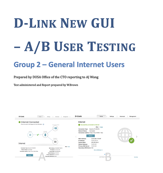
User Trial in Taiwan
Collect feedback and troubleshoot problems by conducting User Trial and AB test in Taiwan
Industry Status
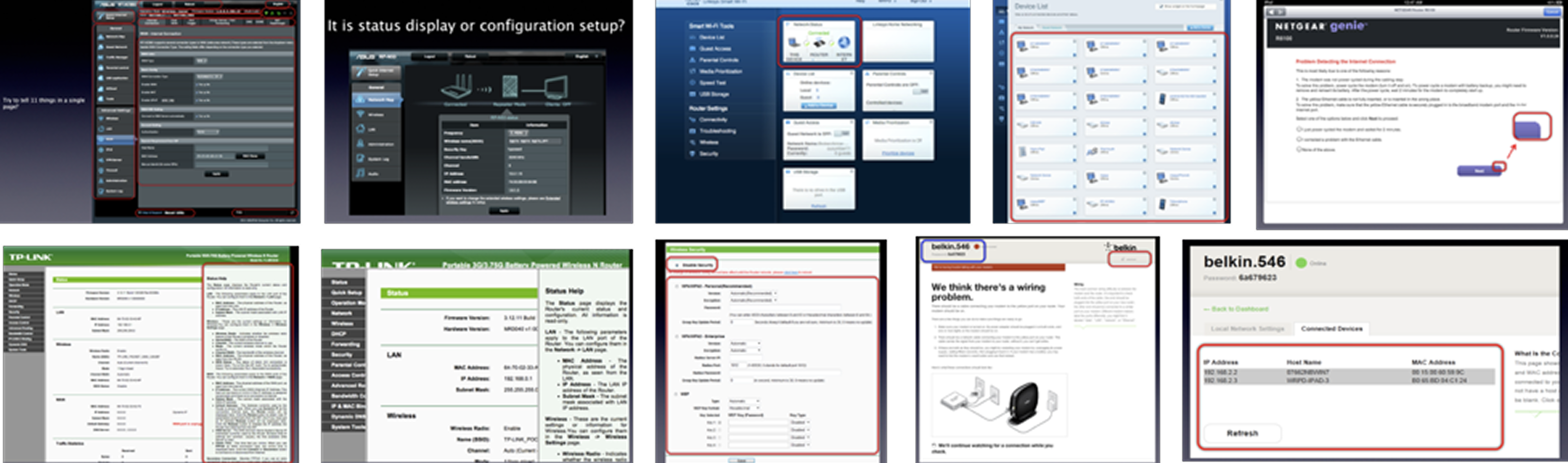
A/B test profile
Refine Goals
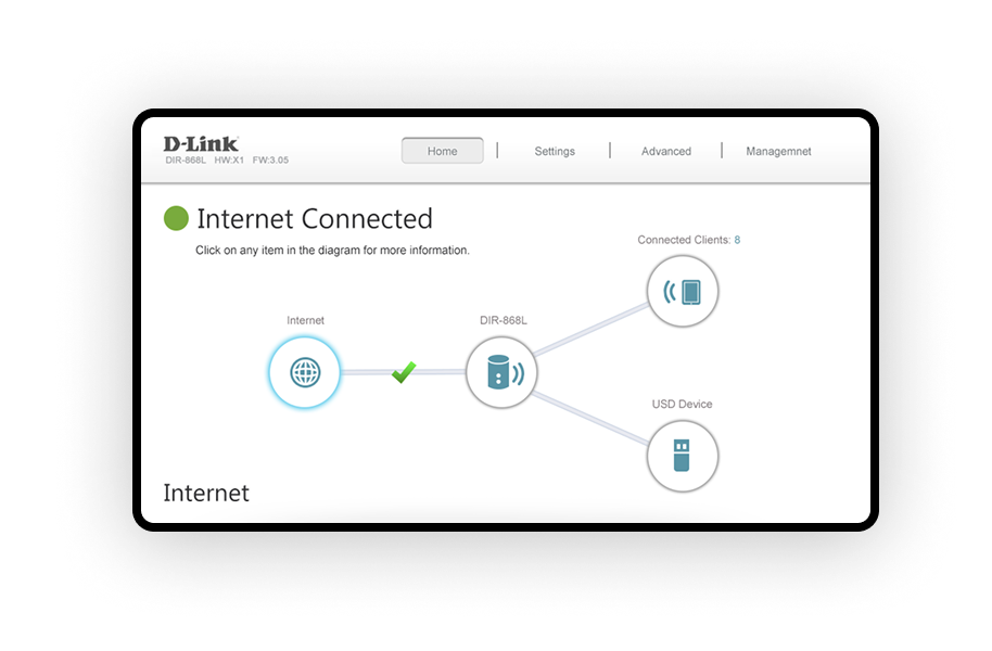
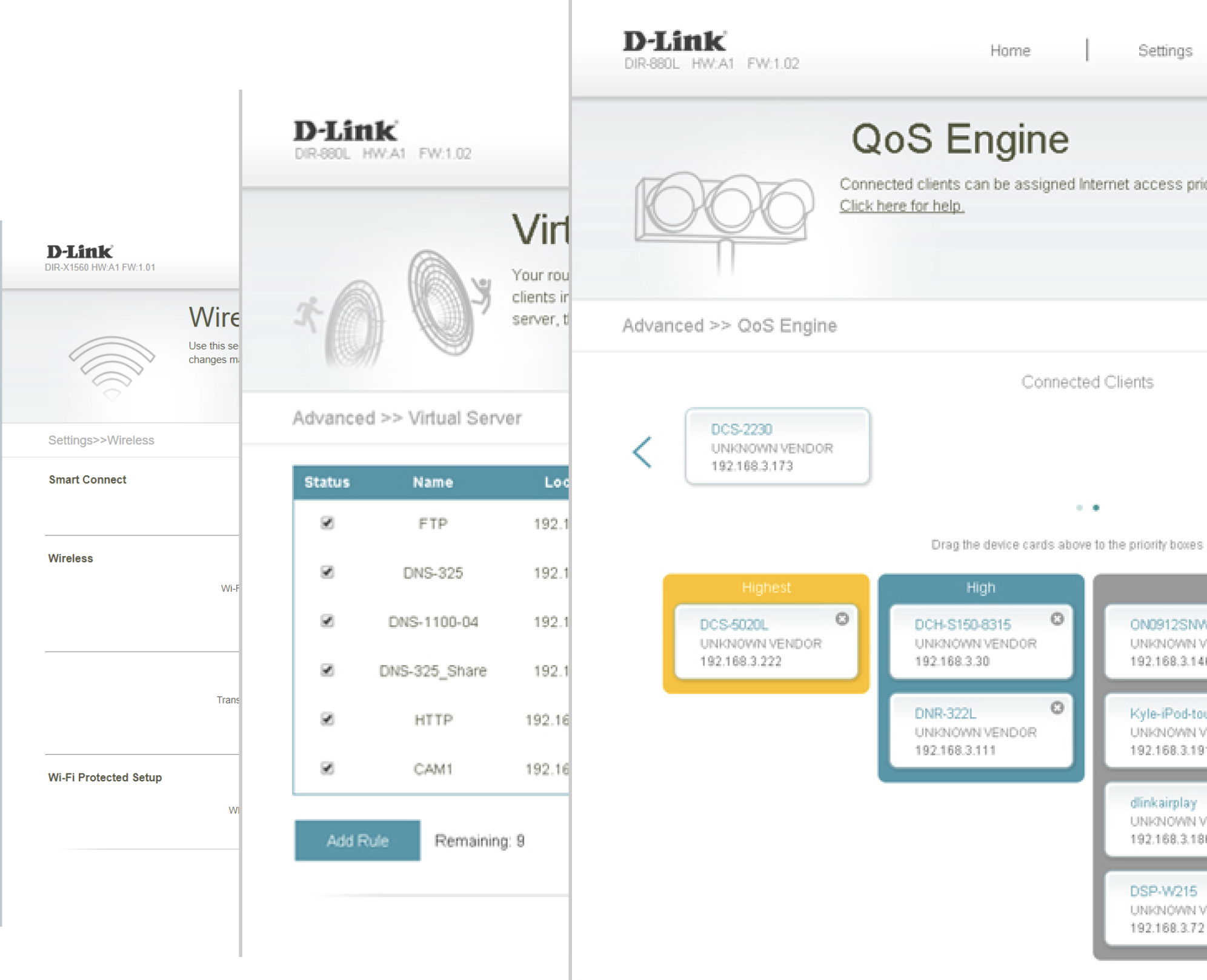
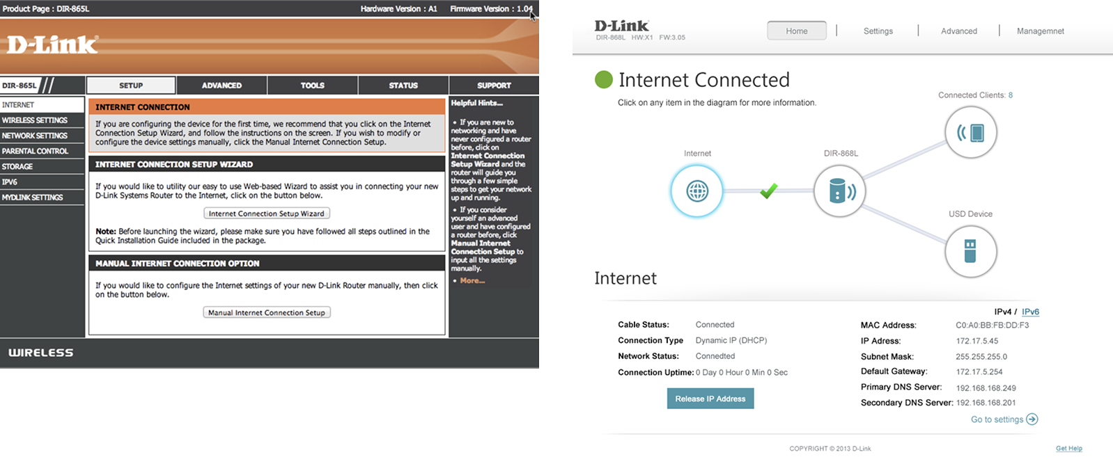
Simpler Interface
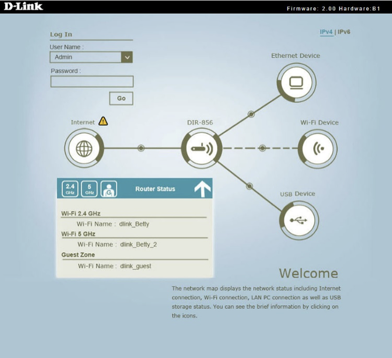
- Clear status map on the home page.
- Show necessary information ONLY on the status map ( Internet, Router, Wi-Fi Clients, Ethernet Device, USB Device)
More Interactive User Interface
- Intelligent troubleshooting
- All fields default to the most commonly used setting options
Fresher Look
- Abandon the classic orange, use the blue-green consistent with the D-Link LOGO, and the flat style
- Optimized design for touchscreens and tablets.
Design Philosophy
- Comfortable but not “Wow…”
- Intuitive and no learning curve
- Find everything within 2 clicks
- Touch screen AND mouse control
- Work with Retina Display
- Interactive error checking
Web UI Design Footprint
Boldly explored various possibilities for the dashboard design, drawing inspiration from everyday life, movies, and Apple’s design style.
UI Guideline
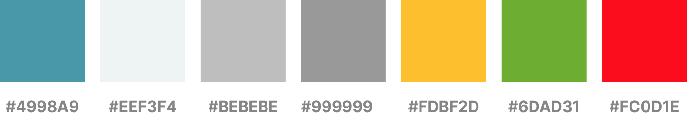
Color Plan
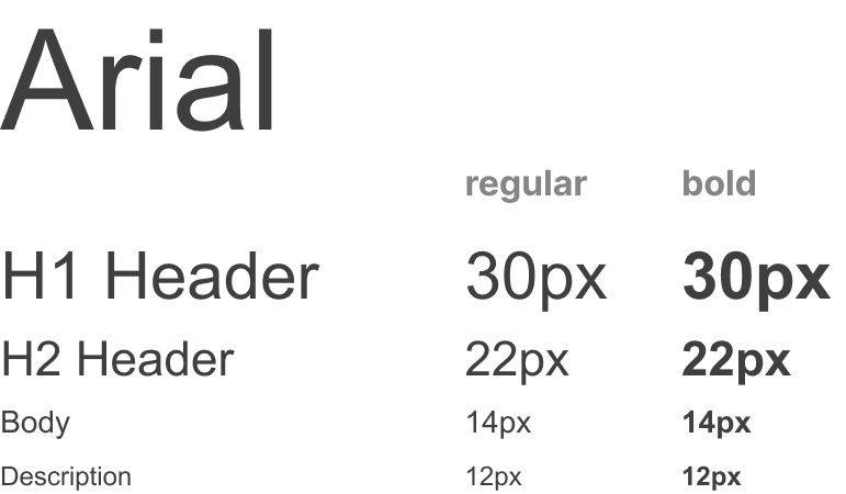
Typography
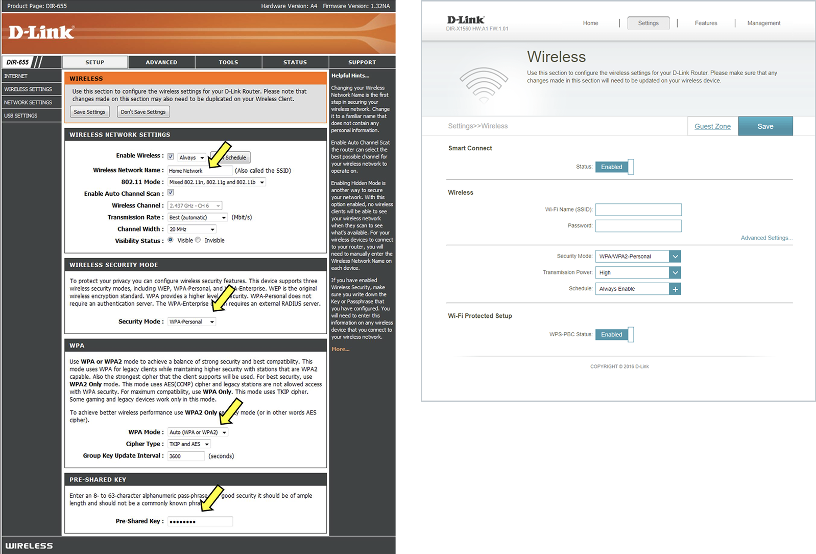
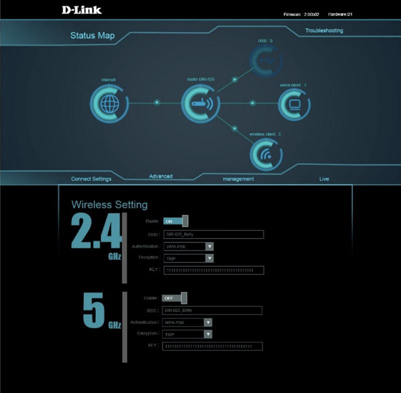
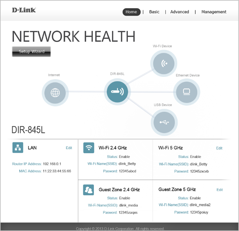
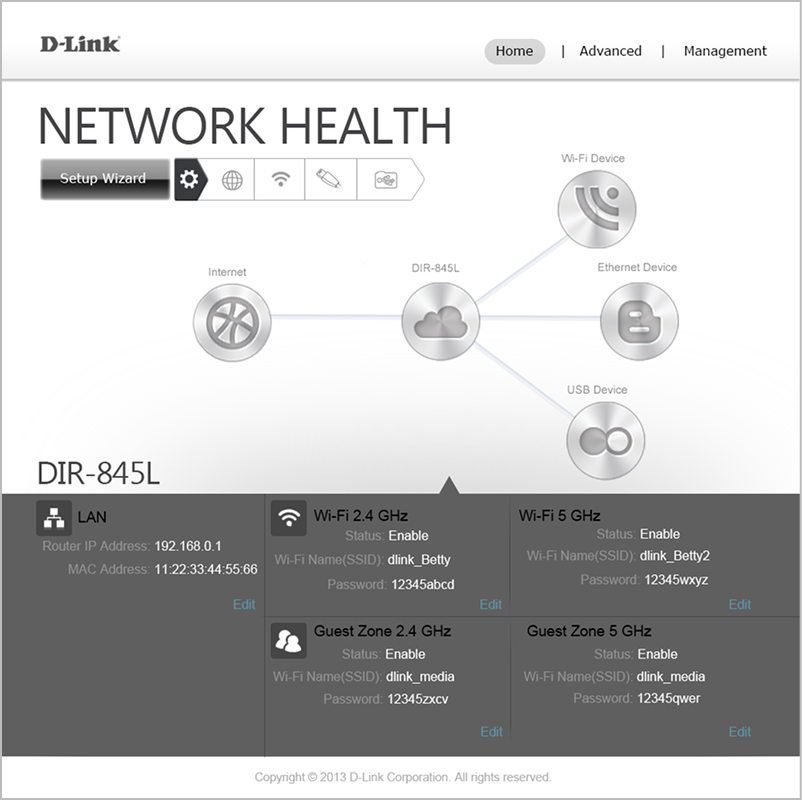
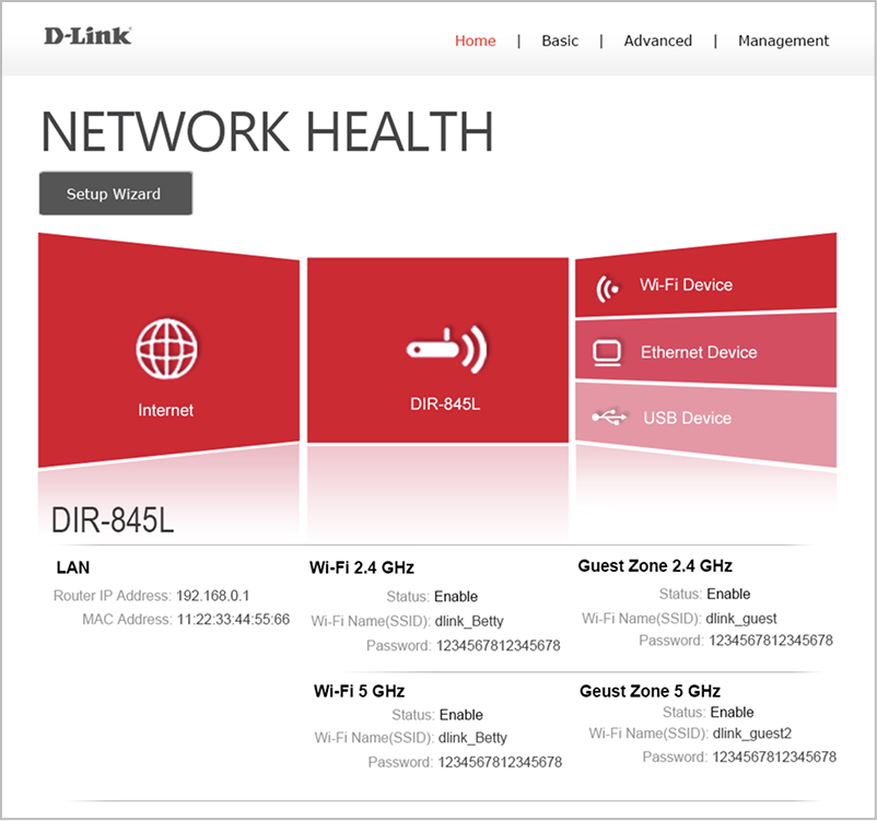
The Final Web UI Design & Before / After
- Get rid of functions which is complex and hardly ever used
- Show the most significant items
- Dynamic Topology Information
- Auto FW Notification And Upgrade
Home Page
Basic Settings Page