Flexible Booking Dates
Extended the booking configuration system in Rezio by introducing a guided path for irregular scheduling scenarios, without disrupting the existing workflow for recurring users.
• Supports payments through 5 payment service providers
• More than 27 countries
TIMELINE
- 2025/4~ 2025/6
- 2 months
MY ROLE
- Led design, worked with PM, FE, BE, QA, and Data Analysts
Impact
- • Led end-to-end UX design
- • Defined product structure with PM
- • Collaborated with engineers on constraints
Context
Merchants on Rezio operate with different scheduling models.
Recurring scenarios (majority):
- Camping reservations
- Theme park tickets
- Workshop classes
(These follow predictable weekly patterns)
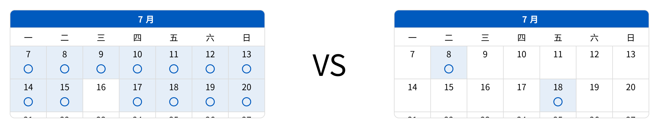
Irregular scenarios (edge cases):
- Ski trips
- Christmas and New Year's Eve bookings
- Special event reservations
(These only open on specific or non-recurring dates)
Problem
The current system is built around weekly recurring rules.
While this works well for most merchants,it fails to support irregular scheduling scenarios.
- Time-consuming manual setup
- High risk of misconfiguration
- Inefficient for non-recurring use cases
As a result, merchants rely on workarounds or inefficient processes.
Key Insight
Instead of redesigning the entire system,introducing a parallel path for irregular scenarios is a more scalable and less disruptive solution.
This allows the system to remain efficient for the majority while supporting edge cases effectively.
Design Strategy
- Preserve the existing workflow for recurring users
- Introduce a guided entry point for irregular scenarios
- Minimize disruption to current user habits
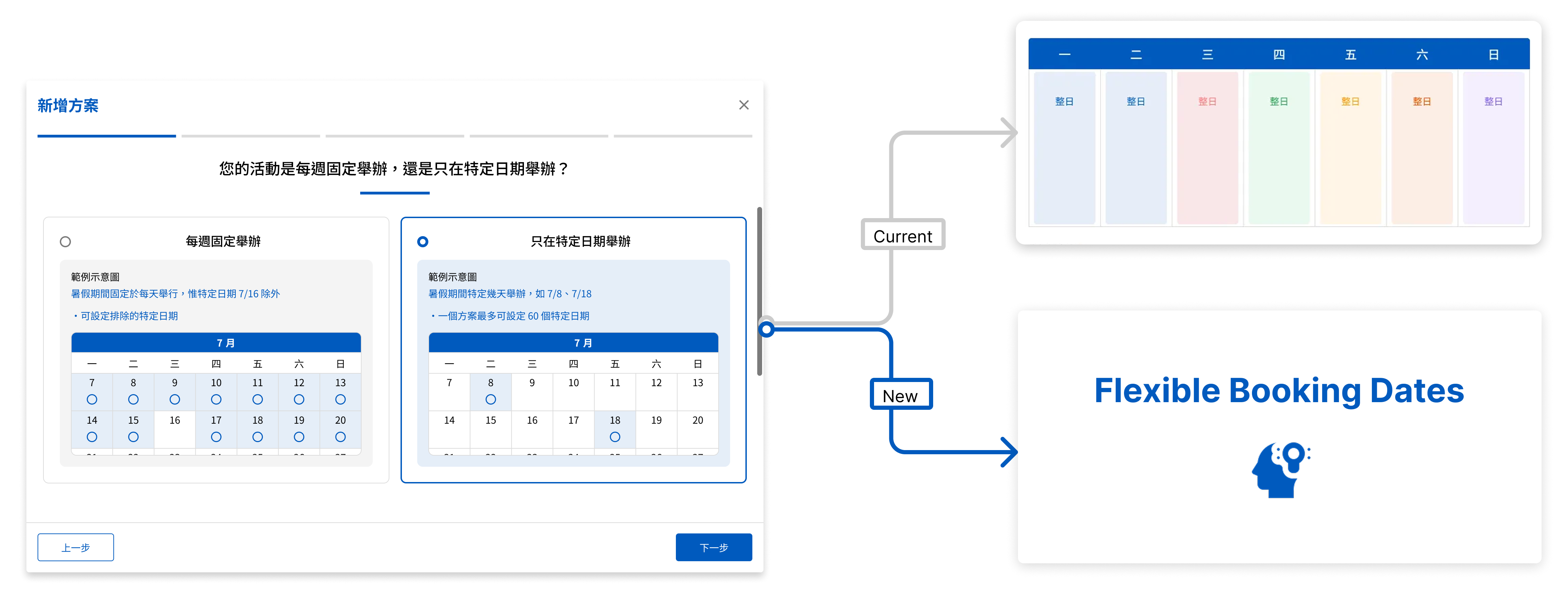
Solution: Entry Flow / Smart Routing
Introduced a short questionnaire to guide users into the appropriate configuration path.
- Reduces decision friction
- Prevents misconfiguration
- Matches user mental model
Key Challenges
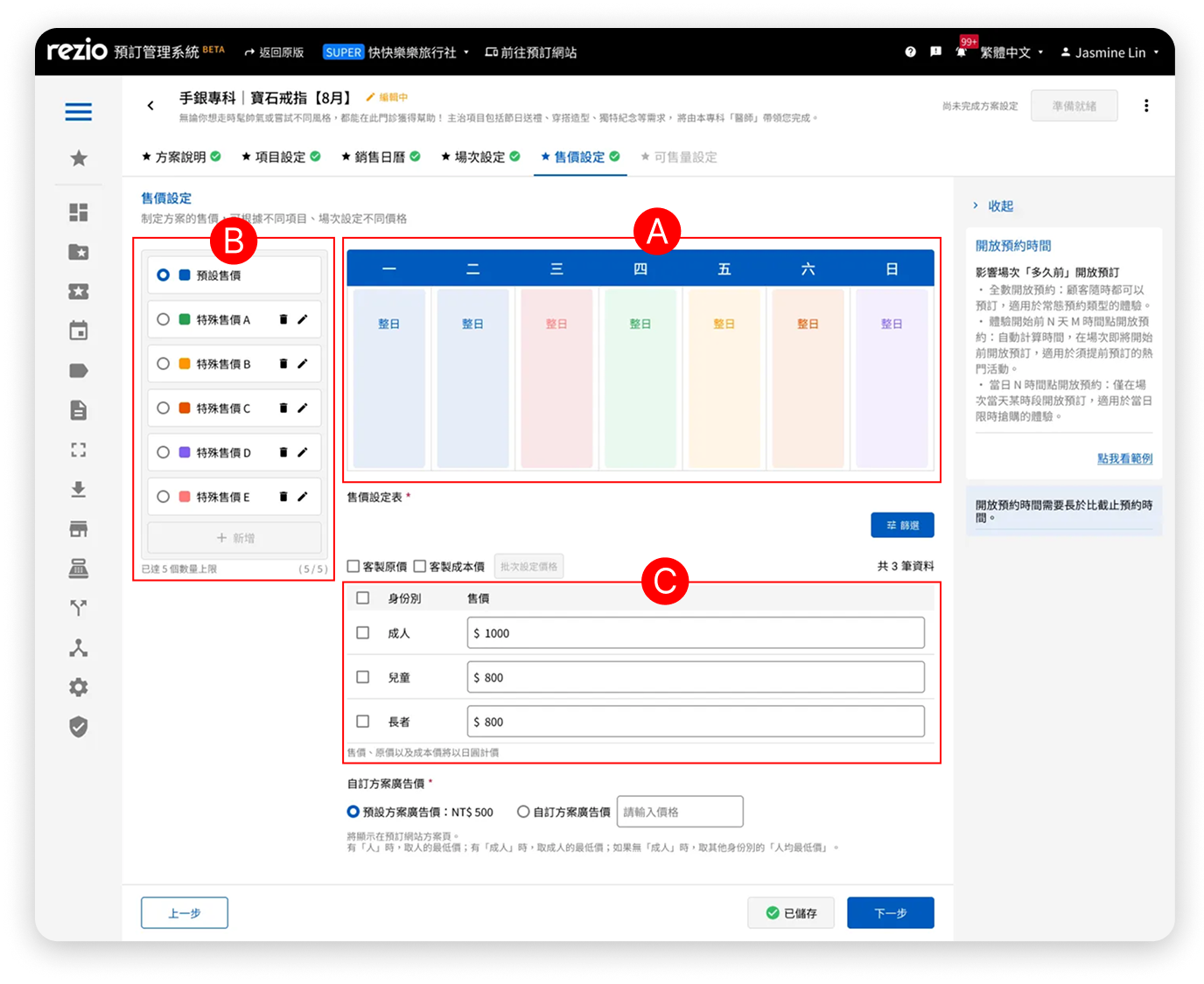
A. Dependency on legacy configuration logic
The "Specific Dates" feature needed to align with existing base settings, which introduced constraints and potential confusion in pricing relationships.
This required careful restructuring of the interaction flow to avoid conflicting logic.
B. Handling wide variations in date scale
Specific dates can range from a few days to over 200 days.
This required a flexible layout that could scale without overwhelming users, while still keeping pricing information visible within the first viewport.
Design Decisions
1. Split the configuration into two modes
To address two fundamentally different use cases—recurring schedules and irregular dates—we separated the flow into distinct modes.
This prevents users from combining incompatible rules and reduces configuration errors caused by misaligned mental models.
2. Focus on one pricing rule at a time
Instead of displaying multiple special pricing rules simultaneously, we simplified the interface to show only one active configuration.
This reduces cognitive load and allows users to focus on a single task, improving both accuracy and confidence during setup.
3. Remove non-essential visual cues when not applicable
Color indicators for special pricing were removed when no pricing rules were applied.
This ensures the interface reflects the actual system state, avoids unnecessary visual noise, and keeps users focused on their primary task—setting prices.
Design Principles
- Ensure all selected dates are visible at a glance
- Keep interactions intuitive with no learning curve
- Use color to differentiate without introducing ambiguity
- Maintain a constrained layout height to preserve pricing visibility
- Present only one pricing rule at a time to reduce complexity
- Ensure validation and error states remain visible and actionables
Cross-functional Collaboration
To align on business priorities and technical feasibility, I initiated a cross-functional kickoff with PMs and engineers early in the process.
This helped surface key constraints—such as system dependencies and component limitations—before design execution.
During the design phase, we conducted iterative reviews in small groups, enabling faster feedback loops and more informed design decisions.
UI Implementation
A. Special pricing display area
Design 1
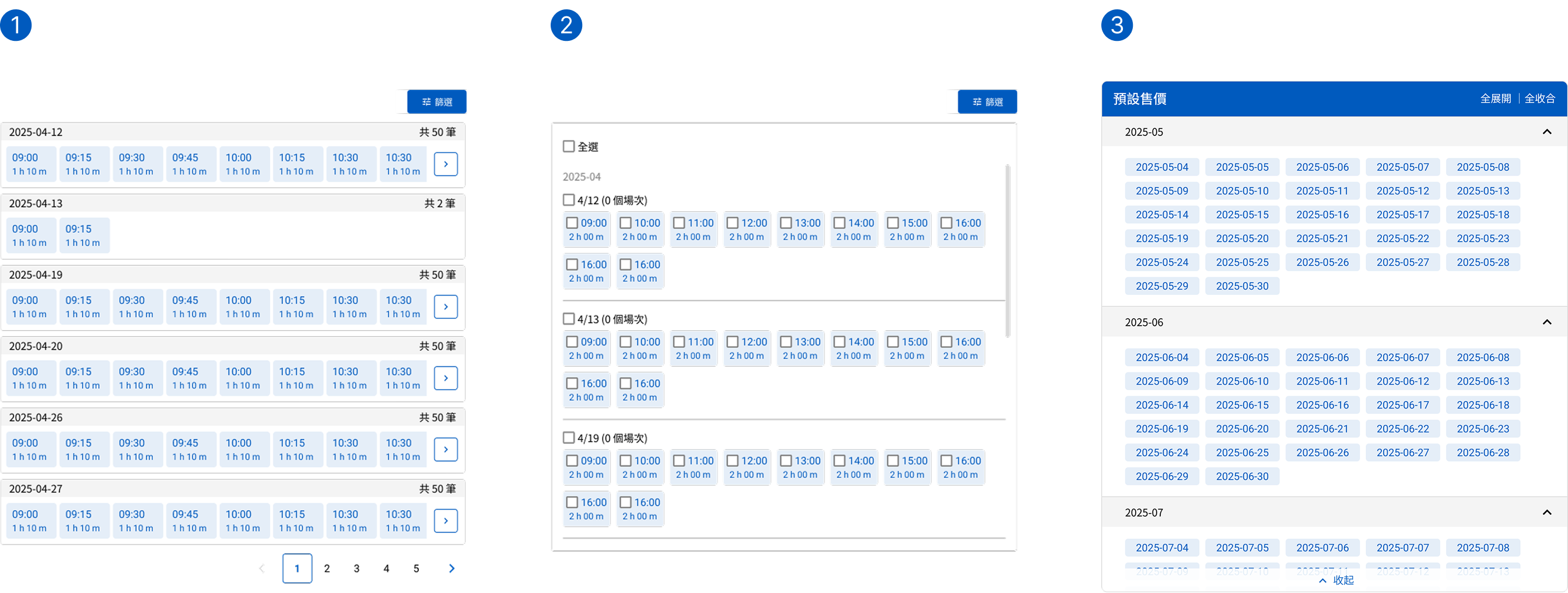
This type of pagination requires multiple clicks to view all specific dates, and it makes it difficult to see everything at a glance.
Design 2
The hierarchy between year, month, date, and session information is unclear.
Design 3
At the same time, it retains the advantages of both clear visibility and efficient content organization.
B. Menu for switching special pricing
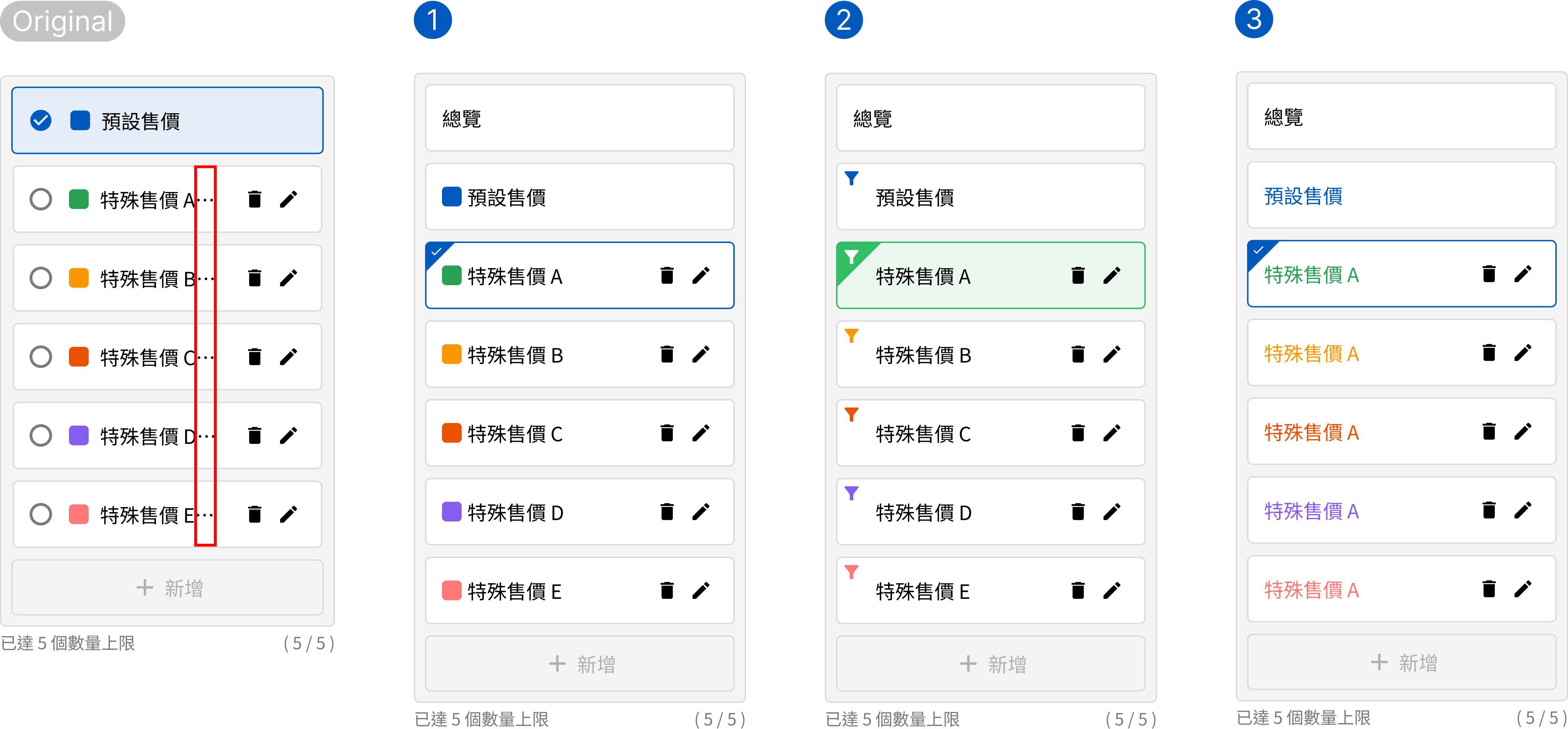
Original version
In multi-language environments, long text strings often result in “...”.
Design 1
Space savings are minimal, and the text display area remains insufficient.
Design 2
The funnel icon may not be immediately understood by all users.
Design 3
There is now more space to accommodate longer text strings.
C. Error states for the two types of pricing tables
Design 1
A temporary solution that follows the original Design System but adds a shared error message at the bottom left for better integration.
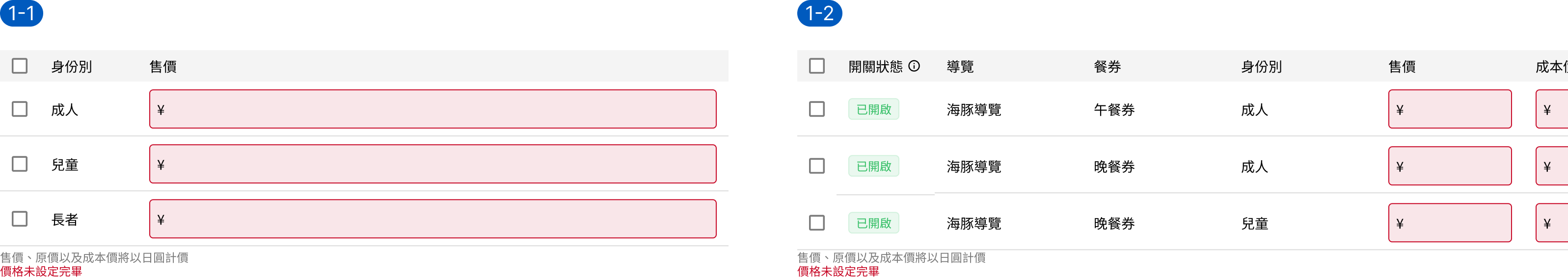
Design 2
Changed the error background from the input field to the entire row for better visibility, but with limited adaptability and a need to adjust the badge style.
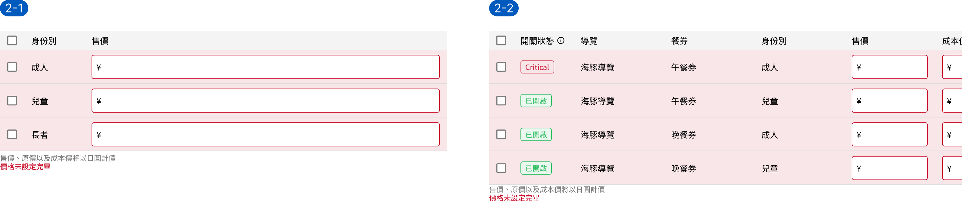
Design 3
Only the input field background is marked with the error color, which avoids modifying the badge style but results in unclear visual semantics.
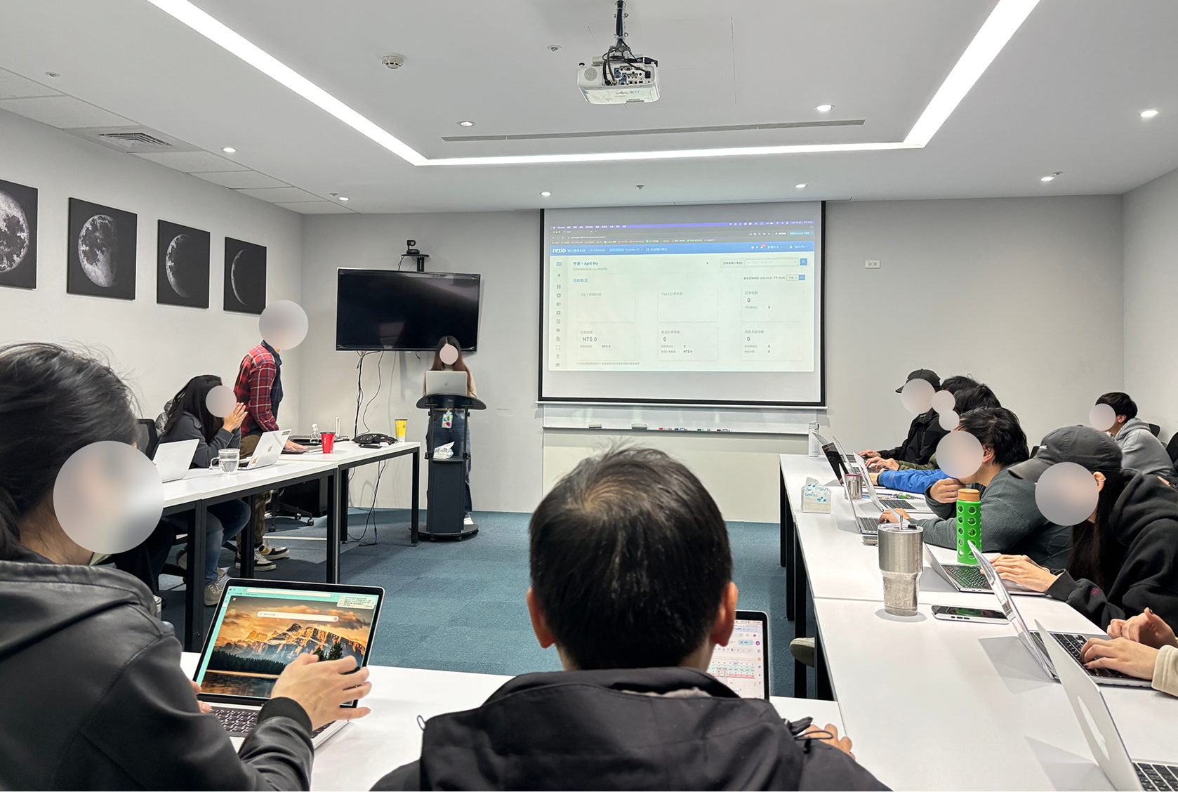
User Test
The sessions were jointly organized by the Design and PM teams, with members taking turns as moderators, observers, and summary facilitators.
- Four user test sessions were conducted based on job roles and departments: Pilot Test 1 (RD), Pilot Test 2 (PM), Formal Test 1 (AM), and Formal Test 2 (BO).
- Participants and observers sat in pairs, while the moderator projected the test tasks to ensure everyone stayed synchronized and on schedule.
- Each session was limited to one hour. After completing the tasks, the moderator and participants stayed to fill out the questionnaire.
- Observers moved to another meeting room to discuss and consolidate their findings, then returned to the main room for a debrief led by the summary facilitator.
- After the sessions, we used the SUS to evaluate usability and collaborated with the PMs to refine and adjust the features that needed improvement.
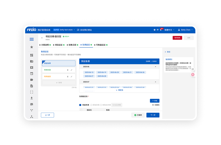
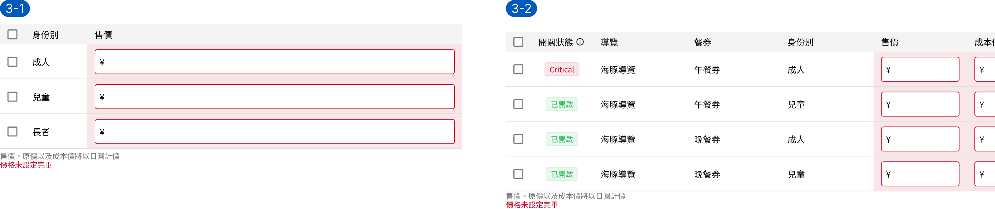
The Final Design
1. The text space for the Special Price menu has been expanded.
In the previous design, all special prices were shown at once and distinguished by color. The new design simplifies the view by displaying only the price that needs to be edited at the moment, resulting in a clearer and more focused user flow.
2. Only display necessary information
Display a specific date badge when adding a special selling price
3. Display one price date or session at a time
In the previous design, all special prices were shown at once and distinguished by color.
4. The pricing table's design system underwent only minor adjustments
The input error style in the Design System remains unchanged, but the Field component now includes a new error style with red text displayed at the bottom left.